 Home
Home
 Suppliers
The Whole Works
The Whole Works
By David
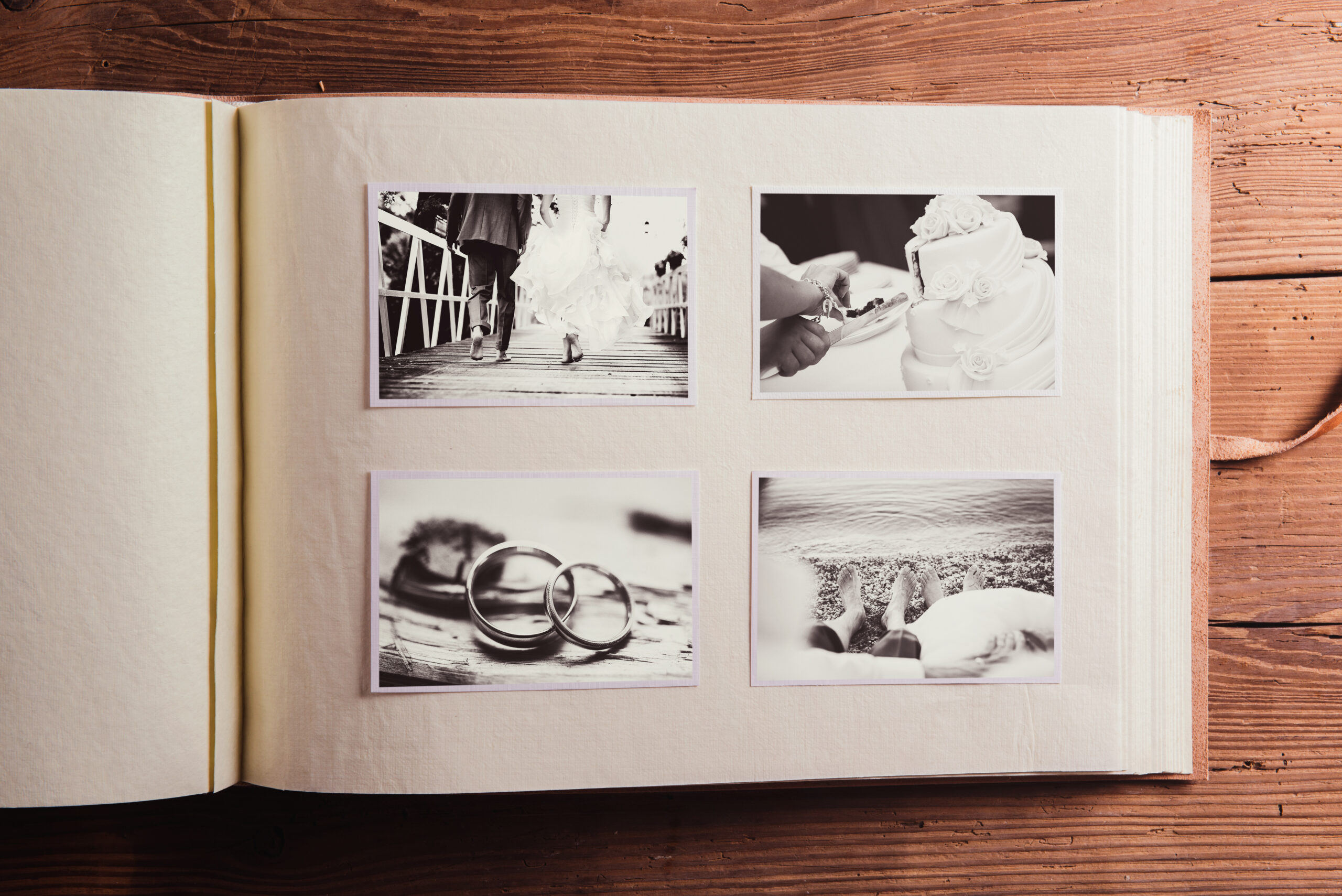
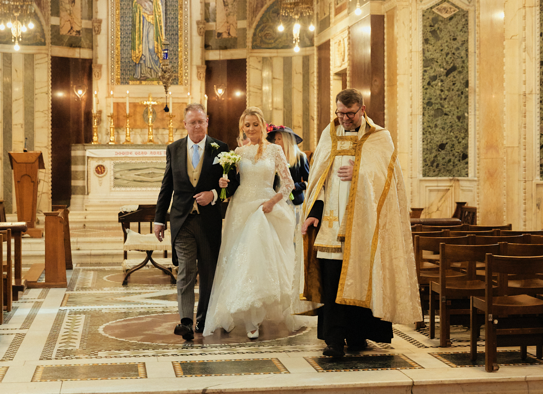
A wedding is obviously an auspicious occasion and everyone wants those moments to stay afresh forever. Capturing those wonderful moments is best done with a perfect photo album design. However, to get things right and thus impress your customers, you have to pay attention to a lot of elements.
There are certain photos that easily grab the viewer’s attention. This can cause him to lose a visual direction and the gracefulness of other images gets almost unnoticed. Lowering opacity of such images helps in guiding the viewer’s focus. Gradient Fades:
Provide a lax transition between photos and can also be used for hiding certain of pictures. Darker images are made to fade into black background and lighter pictures are usually dwindled to white backgrounds.
There are certain instances when smaller images are positioned on larger ones by album design companies. This can be helpful when there is limited space. Sequence actions can also be conveyed via this inset effect.
When images don’t fill a particular page, bars can be used for filling the remaining space. They also provide framing. Blocks work well when an image collection doesn’t complete a rectangular shape.
A pristine and elegant look requires optimal spacing between images. You can use tight or medium spacing as per the demands of situations. Negative spaces are also effective when you want certain images to grab more focus.
Visual boundaries are important in an album. It has great impact when dark backgrounds have lighter images, and darker images are placed on white backgrounds. Otherwise, images will seem untidy and blended to the backdrop.
Existing images needs to be enhanced sometimes. Colours can be selected from within the images. If used optimally, they can complement the entire design rather than distracting the viewers. This is one of the most operative wedding album design tips.
Selecting fonts is pivotal as it provides a tone to the layout. Each font conveys a different emotion. For instance, script fonts provide a romantic and lighter feel while the Romanesque fonts are imbued with a sense of formality.
Carefully using embellishments that compliment the album tone. They should match either to the feel or image patterns used.
Proposed Changes to UK Marriage Laws: What You Need to Know The government has announced what it calls the biggest overhaul of marriage laws in England and Wales since the 19th century. The proposals aim to make weddings more flexible, boost the hospitality industry, and give couples more choice over where and how they marry. […]
Read More
One of the first decisions couples face when planning their wedding is whether to invite kids. Children can bring something special to the event and might even have their own roles as ring bearers or flower girls, but they also come with extra planning considerations. There’s no right or wrong answer. It’s your wedding after […]
Read MoreYou May Also Like
Explore more posts from the blog
Want In On Our Happy Wedding Letter?
Join over a thousand engaged couples (and counting) who have snagged our fun no-nonsense regular wedding advice and inspo straight to their inbox. Plus you'll get planning checklists & spreadsheets for absolutely nada.
© 2010 - 2026. Whimsical Wonderland Weddings Ltd & Wedissimo Ltd. All Rights Reserved.

Leave a Reply